Have you ever felt your sales team is spinning their wheels, spending too much time on tiny deals that barely move the needle?
I'm currently working with a SaaS with this problem.
They are a typical SaaS with a tiered pricing model.
The lower value packages are in the 100-200 ARR bracket, way too small to justify the manual, time-consuming sales process they're currently using.
The sales team wants to shift gears and focus on bigger accounts, re-engage lost opportunities, and proactively reach out to high-potential customers.
But there's a catch: they're flooded with small, 1-2 seat requests, leaving no breathing room for high-value activities.
But it gets trickier.
Marketing is gearing up to ramp their lead-gen efforts significantly.
But if sales can't handle the influx, that's a poor customer experience and wasted marketing dollars.
To solve this challenge, we needed clear data to understand the potential impact of shifting our sales team's focus.
Specifically, we wanted to answer:
- What's the short-term financial risk if we stop manually handling smaller deals?
- How will this change affect overall sales performance?
- Do we need to grow the sales team, or can we squeeze more juice out of what we've already got?
With a per-seat product ranging from 1 to thousands of seats, analyzing and comparing data would be a mess.
But that's where cohort-based analysis comes into play.
It helps you group deals logically so you can clearly see the impact of shifting your sales team's focus.
So how do you do that in HubSpot?
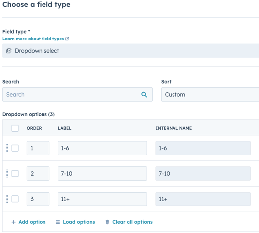
Step 1: Decide on your cohorts
First, group your deals into meaningful segments. For this case, we focused on smaller deals – the biggest area of change.
We chose cohorts of 1-6 seats, 7-10 seats, and 11+ seats.
.png?width=856&height=570&name=Untitled%20design%20(14).png)
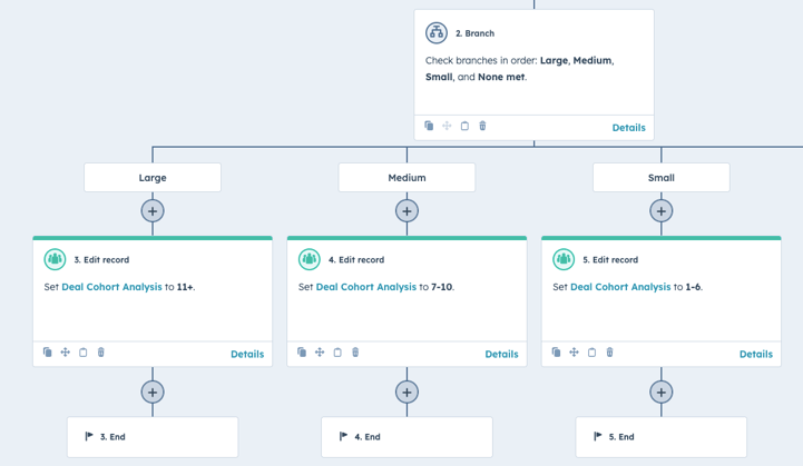
Step 2: Segment your data
Next, group your records into these cohorts.
Because the sales lead had a meeting with the COO the same day (sound familiar?), I took a quick-and-dirty approach:
Created a simple dropdown select property with the cohorts.
Built a basic workflow based on line item quantity to assign deals to the right cohort.
If you have more time, a calculated field can also do the trick nicely (and keep your records cleaner).
Step 3: Build your reports
Once this is set up we can start building the reports we want to set up.
In this case, I wanted to make sure we had an understanding both on the value per cohort, but also the effort spent to close the deal.
So here are some examples of reports we set up for the meeting:
1. Revenue per product
2. Revenue per product (%)
.png?width=856&height=570&name=Untitled%20design%20(15).png)
3. Total revenue
.png?width=856&height=570&name=Untitled%20design%20(16).png)
4. Average revenue
.png?width=856&height=570&name=Untitled%20design%20(17).png)
5. Average time to close
.png?width=856&height=570&name=Untitled%20design%20(19).png)
6. Average number of sales activities
Here, I use the "Number of times contacted" property to avoid getting tasks and notes into the statistics. That may be relevant in some cases, but here I just want to see the actual engagement with the prospects.
.png?width=856&height=570&name=Untitled%20design%20(18).png)
By setting up these cohort-based reports, we can quickly see how much revenue is at stake and get a sense of how much effort the team spends per deal size.

